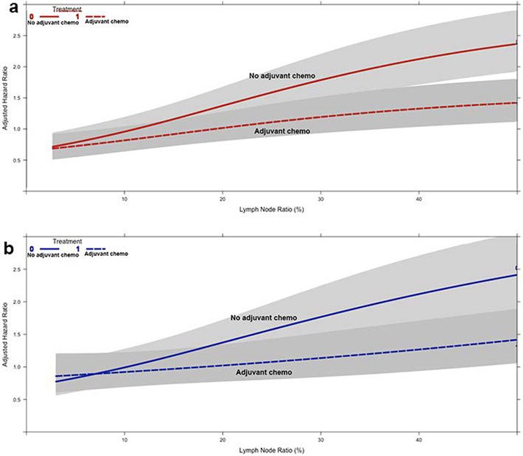
Figure 2.
Graphs of the interaction between lymph node ratio (X-axis), receipt of adjuvant chemotherapy (curves), and adjusted hazard of mortality (Y-axis) in (a) patients in the overall cohort and (b) propensity score-matched subgroup. The grey regions represent the bounds of the 95% confidence interval

