Figure 6.
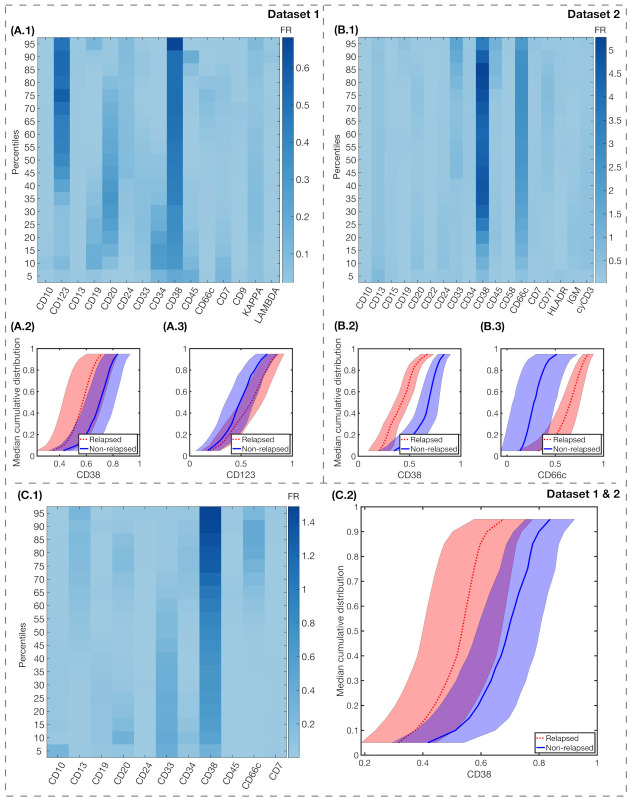
Fisher’s Ratio analyses and median cumulative distributions of markers with highest FR. Fisher’s Ratio Matrices for Dataset 1 (A.1), Dataset 2 (B.1), and both datasets combined (C.1). The common parameters within each dataset are represented in the x-axis, while in the y-axis we represent the percentiles of the median cumulative distribution. Colorbars show the intensity of the Fisher’s Ratio for each percentile and marker. Median cumulative distributions and standard deviation bands of the IPT markers with highest FR, for relapsed (red, dotted lines) and non-relapsed (blue, solid lines) patients are represented in the following charts: for Dataset 1, CD38 (A.2) and CD123 (A.3); for Dataset 2, CD38 (B.2) and CD66c (B.3); and, for both datasets combined, CD38 (C.2).

