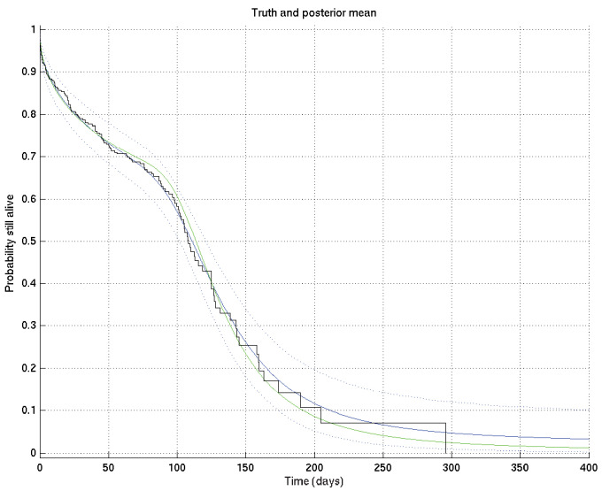
Appendix 2—figure 3. Output of test run using synthetic data for which the right answer is known.
The true survival probability curve is shown in green, with the Kaplan-Meier plot corresponding to the generated data in black. In blue is the posterior mean survival probability against time, calculated from , and in dotted lines the 2.5% and 97.5% centiles, which indicate the uncertainty in the inferred distribution. The synthetic dataset comprised 300 hypothetical patients of whom the time of death of 153 was censored.

