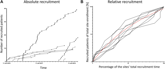
FIGURE 2.
Recruitment rates per site. Both panels show the recruited patients per study site over the total study period. In panel (A) each patient is represented by one symbol, patients of one site are connected by lines. Panel (B) shows normalized data, the percentage of patients recruited over the percentage of each site’s recruitment time. The dashed line is a non-linear curve fit of all curves indicating that the mean recruitment rate is highest at recruitment start.

