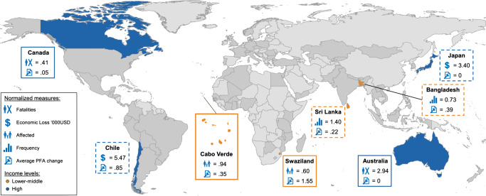
Fig. 3. Map of candidate countries illustrating different selection logics involving natural hazard frequency, severity, and policy change.
Country cases are identified based on the results shown in Fig. 1a–d. Each pair includes two countries at the same income level (World Bank’s fiscal year 2015) experiencing similar hazard impacts (normalized measures) but different levels of average PFA changes (Cabo Verde and Swaziland, lower–middle-income category [orange]; Chile and Japan, high-income category [blue, dashed line]), and two countries experiencing different hazard impacts but similar levels of average PFA changes (Canada+Australia, high-income category [blue]; Bangladesh+Sri Lanka, lower–middle-income category [orange, dashed line]). Frequency and severity measures are normalized in relation to the 30-year baseline. All other countries (n = 77) included in the study are shaded (dark gray). Source Data are provided as a Source data file. World map created using a dataset in shapefile format downloaded (November 12, 2020) from http://thematicmapping.org/downloads/world_borders.php under the Creative Commons Licence Attribution-ShareAlike 3.0 Unported (CC BY-SA 3.0): https://creativecommons.org/licenses/by-sa/3.0/ (no modifications made to the material). Icons source: OCHA (United Nations for the Coordination of Humanitarian Affairs), downloaded (November 12, 2020) for free on ReliefWeb: https://reliefweb.int/report/world/world-humanitarian-and-country-icons-2012.

