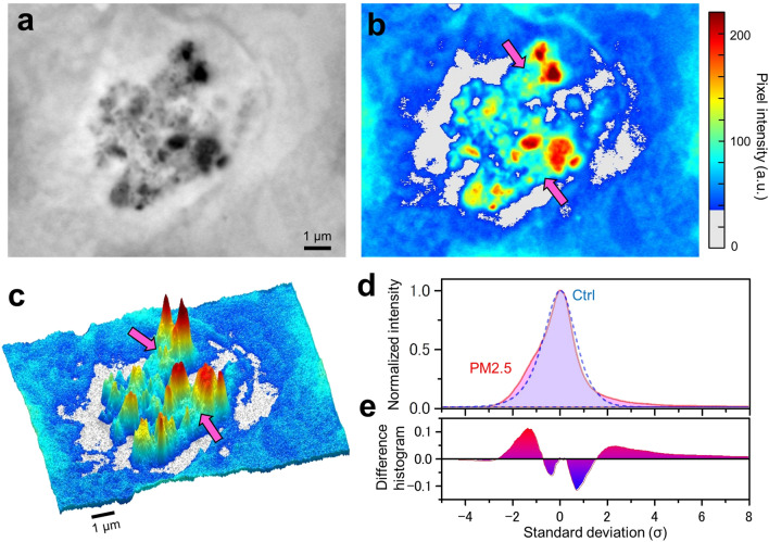
Figure 3.
Analysis of pixel intensity at the PM2.5 aggregates in a cell. (a) A high-magnification (10,000×) SE-ADM image of a PM2.5 aggregate in OBA9 cells. (b) A pseudo-colour map of (a) after intensity inversion. Pink arrows indicate the region assumed to be proteins near the PM2.5. (c) A 3D intensity-colour map of (b). Various shapes of particles were detected in a cell. The PM2.5 aggregates were surrounded by the white region in the image, which was thought to represent intracellular membrane structures. (d) Comparison of the distribution of averaged pixel intensity with or without addition of PM2.5 to the cell. The dashed blue curve (control: without PM2.5) displayed a normal probability distribution. The pink curve (with PM2.5) showed positive deviation from the normal probability distribution in areas of higher than 2 standard deviations (σ) and lower than − 1σ. (e) A difference histogram between the pink and dashed blue curves. It shows the difference more clearly in the σ areas higher than 2σ and between − 1σ and − 2.5σ. Scale bars, 1 μm in (a, c).

