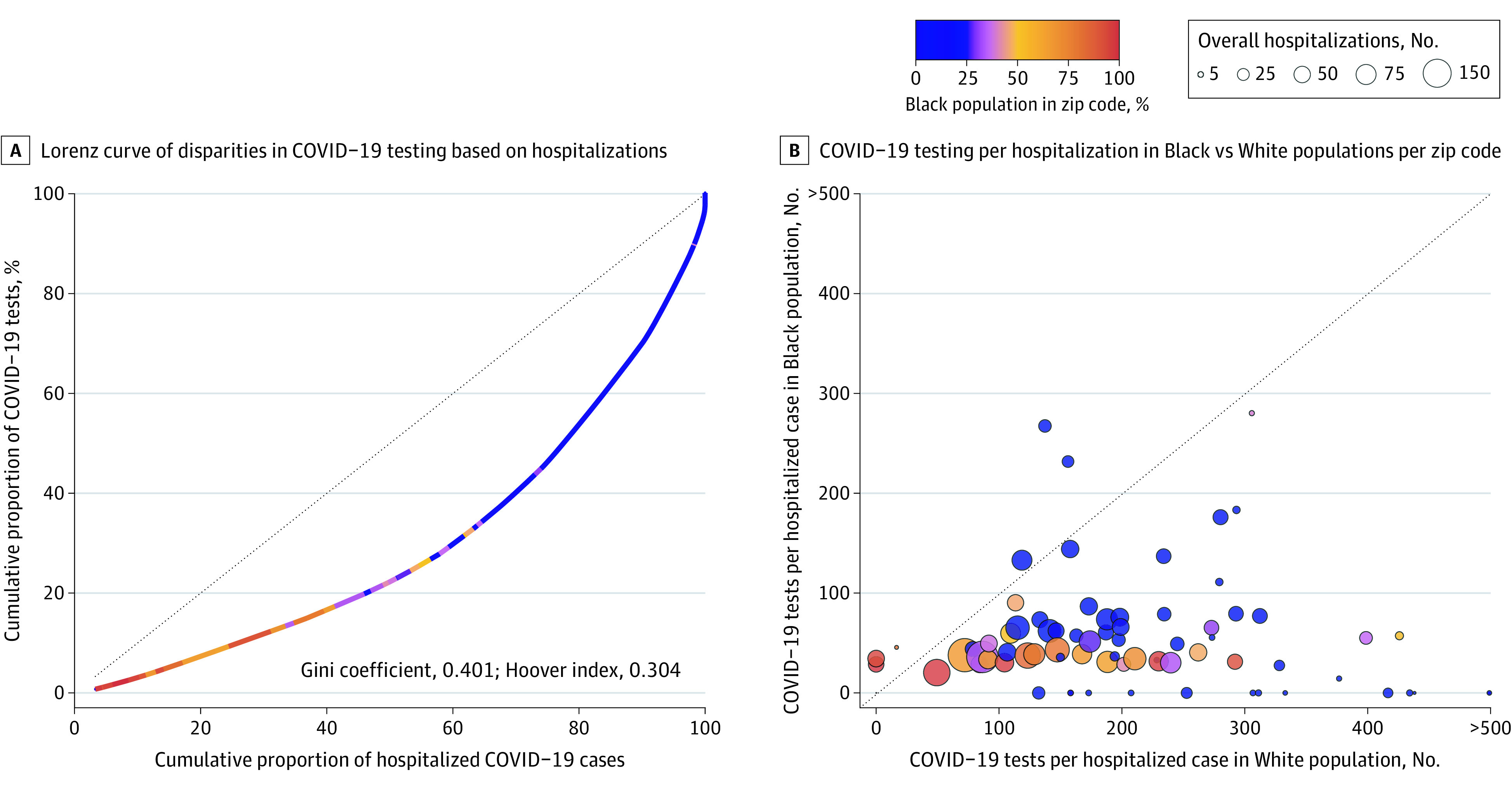
Figure. Disparities in Coronavirus Disease 2019 (COVID-19) Testing Relative to Hospitalizations in 7 Counties in the St Louis Region, March 14, 2020, to August 10, 2020.

A, Modified Lorenz curve examining disparities in COVID-19 testing relative to the disease burden. The units of analysis are zip codes and they are color-coded by their overall racial makeup. The dashed line represents equitable distribution where 50% of testing would be conducting in zip codes accounting for 50% of hospitalizations. B, Testing rates in Black vs White residents of the same zip code. Each bubble represents a zip code. Bubbles are color-coded by the racial makeup of the zip code and sized by the absolute number of COVID-19 hospitalizations. The dashed line represents equal rates of testing per hospitalization between Black and White residents, with zip codes falling below it having increased testing rates in White residents and zip codes falling above it having increased testing rates in Black residents.
