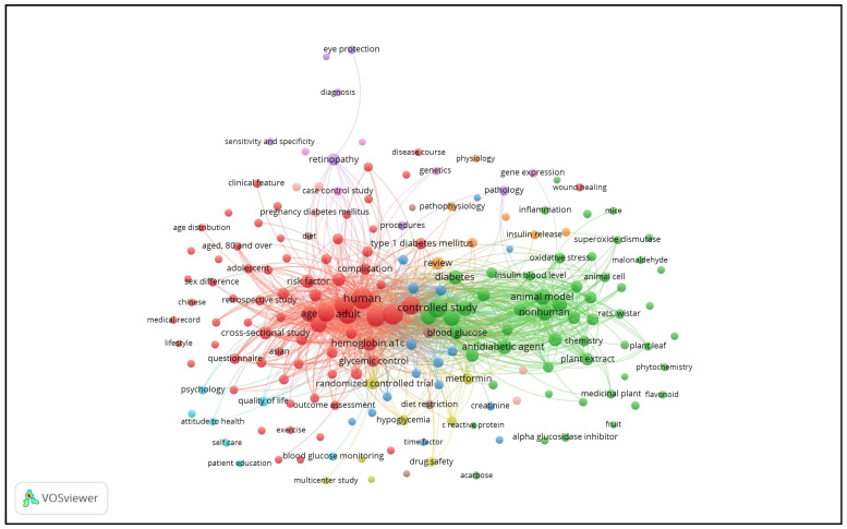
Figure 10.
Radar chart showing the keyword links visualization of the diabetes research output. Note: The threshold was set at ≥35 occurrences. Keywords shown in the same color are closely related and clustered together. The size of nodes and words represent weights; the bigger the nodes and words, the larger the weights. The distance between two nodes reflects the strengths between them; a shorter distance means stronger relations. The line between two keywords means that they appeared together; the thicker the line, the higher the co-occurrence.

