
Figure 4.
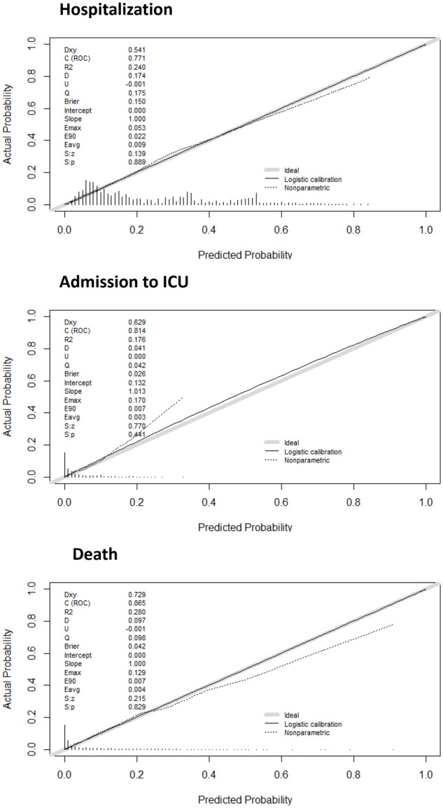
Calibration plots of the final models for predicting hospitalization, ICU admission and death in the derivation cohort. The dotted line shows the actual relation between observed outcomes and predicted risks; the solid line shows the smoothed relation. Ideally, these lines equal the dashed diagonal line that represents perfect calibration.