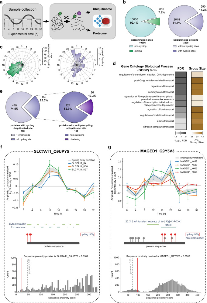
Fig. 4. Quantification of the rhythmic ubiquitinome.
a Experimental workflow for rhythmic ubiquitinome analysis. b Proportion of oscillating ubiquitination sites (q-value < 0.1) quantified in >50% of all samples (left panel, green) and proteins with cycling ubiquitin sites (q-value < 0.1) (right panel, violet) c Rose plots indicate phase peaks for cycling ubiquitination sites (left panel, green) and proteins (right panel, violet). d Overrepresentation analysis of gene ontology biological processes (GOBP) filtered for top 10 significant terms. Significance is determined by 5% false discovery rate (FDR) (Fisher’s Exact test). e Proportions of proteins with a single and multiple cycling ubiquitination sites (left panel) and those displaying cycling diGly site clusters (right panel). f, g Examples of proximity analysis of cycling ubiquitin clusters (http://cyclingubi.biochem.mpg.de). Cycling sites (q-value <0.1, ±SEM, n = 4 biologically independent experiments for each time point) (top) and their location in the protein sequence along with the domain annotation (middle) and proximity score (average distance, p-value < 0.1) (bottom) for f SLC7A11 (p-value = 0.0161) and g MAGED1 (p-value = 0.0863). Source data are provided as a Source data file.

