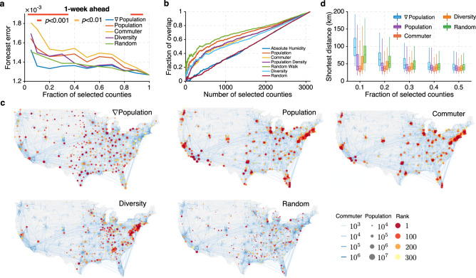
Fig. 4. Surveillance networks at the county level.
a Forecast error for 1-week ahead ILI+ predictions using surveillance networks consisting of 5%, 10%, 20% up to 100% of all counties. Networks are selected by population gradient (∇Population) (blue line), population (red line), commuter (orange line), diversity of commuters’ residential locations (purple line), and random selection (green line). The statistical significance for population gradient outperforming all other methods is reported using the horizontal bars on top (two-sided Wilcoxon signed-rank test; red: p < 0.001, orange: p < 0.01, none: p ≥ 0.01). b Overlap between the counties selected by ∇Population and those selected by other attributes: absolute humidity (blue line), population (red line), commuter (orange line), population density (purple line), random walk centrality (green line), diversity of commuters’ residential locations (light blue line), and random selection (dark red line). c Visualization of surveillance networks consisting of 10% of all counties selected by population gradient, population, commuter numbers, commuter diversity and random selection. Blue curves on the map represent county-to-county commuting. Node color indicates the ranking using different methods, and node size reflects the population size. d Comparison of the distributions of distance between nearest neighbors within surveillance networks designed using different strategies: ∇Population (blue), population (purple), commuter (red), diversity of commuters’ residential locations (orange), and random selection (green). Boxes show the median and interquartile, and whiskers show 95% CI. Distributions were obtained from n = 310, 621, 932, 1243, and 1554 counties, respectively, corresponding to 10%, 20%, 30%, 40, and 50% of all counties.

