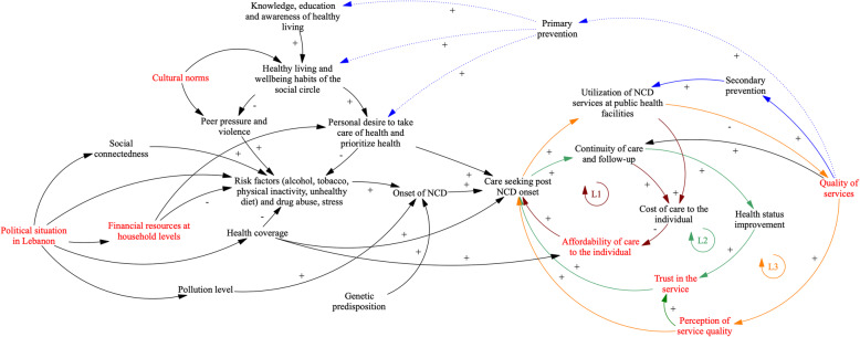
Fig. 3.
Whole system diagram: Arrows in the figure refer to causal connections between variables, as perceived and described by workshop participants. Where arrows indicate a polarity (+/−), this implies positive or negative associations between variables respectively. For example, the + arrow from “Quality of services” to “Primary prevention” indicates that participants link higher quality of care to emphasis on primary prevention activities within the health system. Where polarities are missing from arrows, participants described that variables related to one another but noted that it was not possible to infer either a positive or negative relationship. Colour is used in the above diagram to indicate the presence of feedback loops. Three loops (dark red – Loop 1, green – Loop 2, orange – Loop 3) are visible in the diagram and are further explained in the body of the paper. Variables in red denote points of fragility as identified by participants. Pathways in blue refer to systemic responses as fronted by the health system: we denote the current prevailing response in a solid blue line (focused on secondary prevention). The dotted line supporting pathways from primary prevention to the distal factors impacting upon NCD onset denotes that participants identified primary prevention as necessary but not implemented widely within the Lebanese health system

