. 2021 Jan 12;10:e57646. doi: 10.7554/eLife.57646

Figure 3. Mathematical model of T cell reconstitution after hematopoietic stem and progenitor cell (HSPC) transplantation.

(A) Schematics of the model. Each circle represents a cell compartment: T represents the HSPCs from the transplant; P, the progenitor cells in bone marrow (BM) and thymus; S and N, CD4+CCR5+ and CD4+CCR5- T cells, respectively; Tp, the protected (ΔCCR5), gene-modified cells from transplant; Pp, protected (ΔCCR5) progenitor cells in BM/thymus; Np1 and Np2 the protected (ΔCCR5) CD4+ T cells; M the CD8+ T cells with naive and central memory phenotype and E CD8+ T cells with effector memory phenotype. The initial fraction of protected cells in the product is represented by the parameter fp. Gray panels represent mature blood CD4+ and CD8+ T cells, and the green panel all ΔCCR5 cells in the model. Red, dashed arrows represent discarded terms after model selection and validation (see text for details). (B) Model predictions using the maximum likelihood estimation of the population parameters (solid black lines) for all blood T cell subsets before ATI for all animals in the transplant groups using model with ΔAIC = 0 (Figure 3—source datas 23). Each gray line is one animal. (C) Model predictions of the total concentration of CD4+CCR5- T cells generated by CCR5 downregulation (dashed line) or thymic export (solid line), and of the total concentration of CD4+CCR5+ T cells generated by proliferation (solid line) or by upregulation of CCR5 (dashed line) over time using the maximum likelihood estimation of the population parameters.

Figure 3—source code 1. Best model file for T cell reconstitution in Monolix format.
Figure 3—source code 2. R code for plots in Figure 3.
Figure 3—source data 1. Values of the fraction of protected cells in transplant product fp, dose or number of hematopoietic stem and progenitor cell (HSPCs) in transplant product D and time of transplantation tx of each animal for model fitting and projections.
We assumed animal weight of 5 Kg.
Figure 3—source data 2. Competing models for fitting T cell reconstitution with respective AIC values.
Best fit in bold-red (lowest AIC). The AIC values presented for each statistical assumption is the lowest of 10 runs of the SAEM algorithm with different randomly selected initial guesses.
Figure 3—source data 3. Population parameter estimates for the best fits of the model in Equation 2 in the main text (lowest AIC in Figure 3—source data 2) to the T cell reconstitution dynamics.
RSE: relative standard error. Empty fields represent a standard deviation of random effects, σψ, fixed to zero. Values of ψ¯ for Kp,N(t0),S(t0),M(t0), and E(t0) shown here are in log10 cell counts/μL assuming a blood volume of of 3 × 105 μL (calculated assuming blood:weight ratio of 60 mL/kg and body weight of 5 kg). Red values represent an RSE greater than 100% implying that the number of data points may not be enough to estimate the respective parameter.
Figure 3—source data 4. Individual parameter estimates for the best fits of the model in Equation 2 in the main text (lowest AIC in Figure 3—source data 2) to the T cell reconstitution dynamics.
Values obtained for N(t0),S(t0),M(t0), and E(t0) shown here are in log10 cell counts/μL assuming a blood volume of of 3 × 105 μL (calculated assuming blood:weight ratio of 60 mL/kg and body weight of 5 kg). Initial values for the control group where obtained assuming steady state.
Figure 3—source data 5. Population parameter estimates for the best fits used in the R code for Figure 3.

Figure 3.

Figure 3—figure supplement 1. Individual fits of the best model to the blood T cell observations pre-ATI in control group from a time relative to post-transplantation in transplant groups.

Figure 3—figure supplement 1.

Empirical data for peripheral T cell subset counts (blue data points) and best fits of the model (black lines) in Equation 2 in the main text to all blood T cell subsets before/after ATI for the control group. Each row is one animal (ID in the leftmost graph per row). Each datapoint shape and color is a different animal sampled over time and is maintained throughout.
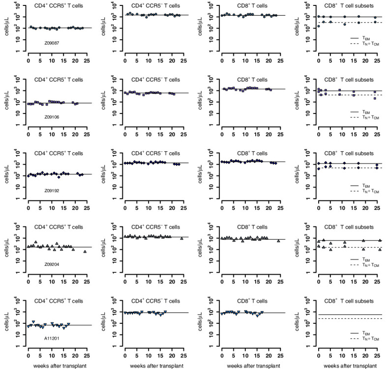
Figure 3—figure supplement 2. Individual fits of the best model to the blood T cell observations post-transplantation, pre-ATI for the wild-type-transplant group.

Figure 3—figure supplement 2.

Empirical data for peripheral T cell subset counts and plasma viral load (red data points) and best fits of the model (black lines) in Equation 2 in the main text to all blood T cell subsets before ATI for the wild-type-transplant group. Each row is one animal (ID in the leftmost graph per row).
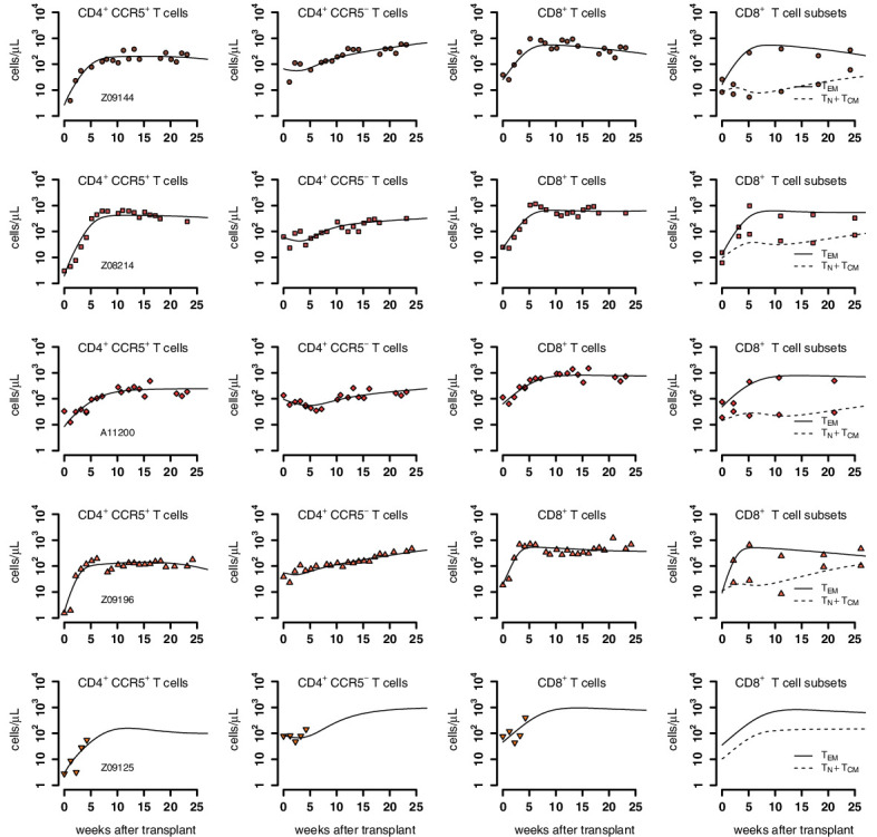
Figure 3—figure supplement 3. Individual fits of the best model to the blood T cell observations post-transplantation, pre-ATI for the ΔCCR5-transplant group.

Figure 3—figure supplement 3.

Empirical data for peripheral T cell subset counts and plasma viral load (green data points) and best fits of the model (black lines) in Equation 2 in the main text to all blood T cell subsets before ATI for the ΔCCR5-transplant group. Each row is one animal (ID in the leftmost graph per row).
Figure 3—figure supplement 4. Predictions of the best model for the contributors to cell expansion in CD8+ TEM cells in animals from the transplant groups.

Figure 3—figure supplement 4.

Solid line represents the total number of cells that proliferate over time r^e(1Np1+N+S+M+EKe)E. Dashed lines indicate the number of exogenous cells differentiated from Tnaive and TCM (λmM) over time using the maximum likelihood estimation of the population parameters.