. 2021 Jan 12;10:e57646. doi: 10.7554/eLife.57646

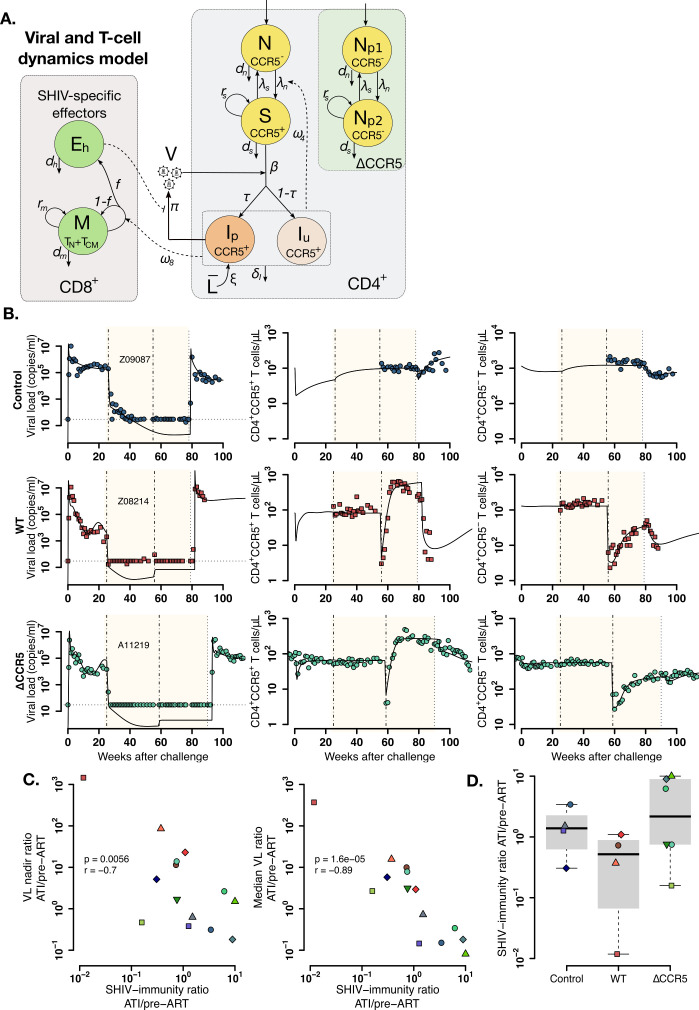
Figure 5. Mathematical model of virus and T cell dynamics following ATI.

(A) Model: Susceptible cells, S, are infected by the virus, V, at rate β. Ip represents the fraction τ of the infected cells that produce virus, and, Iu, the other fraction that becomes unproductively infected. Total CD4+CCR5+ T cell count is given by the sum of S, Ip and Iu. All infected cells die at rate δI. IP cells arise from activation of latently infected cells at rate ξL¯ and produce virus at a rate π. Virus is cleared at rate γ. CD8+ M cells proliferate in the presence of infection with rate ω8 from which a fraction f become SHIV-specific CD8+ effector T cells, Eh, that are removed at a rate dh. These effector cells reduce virus production (π) by 1/ (1+θEh). Non-susceptible CD4+ T cells that were not CCR5-edited upregulate CCR5 in the presence of infection and replenish the susceptible pool at rate ω4. Gray panels represent mature blood CD4+ and CD8+ T cells, and the green panel represents ΔCCR5 cells. (B) Individual fits of the model (black lines) to SHIV RNA (left column), blood CD4+CCR5+ T cells (middle column), and CD4+CCR5- T cells (right column) for one animal in the control (top row), wild type (middle row), and ΔCCR5 groups (bottom row). Shaded areas represent time during ART and dashed-point line, the time of transplantation. (C–D) Scatterplots of observed ATI/pre-ART ratio of the (C) nadir viral load, and the median viral load ratio versus the SHIV-specific CD8+ T immunity ATI/pre-ART ratio:ω8ATI/dhATIω8preART/dhpreART (p-values calculated by Pearson’s correlation test); a higher ratio means a better immune response post-ATI. (D) Individual estimates of the SHIV-specific CD8+ T immunity ATI/preART ratio. Blue: control, red: wild type, and green: ΔCCR5 transplant group.

Figure 5—source code 1. Best model file for T cell and virus dynamics from acute infection after ATI in Monolix format.
Figure 5—source code 2. R code for plots in Figure 5B.
Figure 5—source code 3. R code for plots and tests in Figure 5C–D.
Figure 5—source data 1. Competing models for fitting T cell and viral dynamics (Equations 2-3 in main text) using the best model in Figure 3—source data 2 and fixing parameter values as in Figure 3—source data 3, with AIC values.
Best fit in bold-red (lowest AIC).
Figure 5—source data 2. Population parameter estimates for the fits of the model with lowest AIC in Figure 5—source data 1 to the T cell and virus dynamics.
RSE: relative standard error. Empty fields represent cases when the standard deviation of random effects, σψ, was fixed to zero. Values of ψ¯ for β,ω4,ω8, and I50 shown here are transformed assuming a blood volume of 3 × 105 μL (calculated assuming blood:weight ratio of 60 mL/kg and body weight of 5 kg). Red values represent an RSE greater than 100% implying that the number of data points may not be enough to estimate the respective parameter.
Figure 5—source data 3. Individual parameter estimates for the fits of the model in Equations 2-3 in main text (lowest AIC in Figure 5—source data 1) to the T cell and virus dynamics.
Values of ψ¯ for β,ω4,ω8, and I50 shown here are transformed assuming a blood volume of 3 × 105 μL (calculated assuming blood:weight ratio of 60 mL/kg and body weight of 5 kg). Shown are individual estimates for animals that continued study after ATI.
Figure 5—source data 4. Individual parameter estimates obtained from Monolix for the best fits used in the R code for Figure 5.

Figure 5.

Figure 5—figure supplement 1. Individual fits of the best model to the blood T cell and viral load observations before/after ATI for control group.
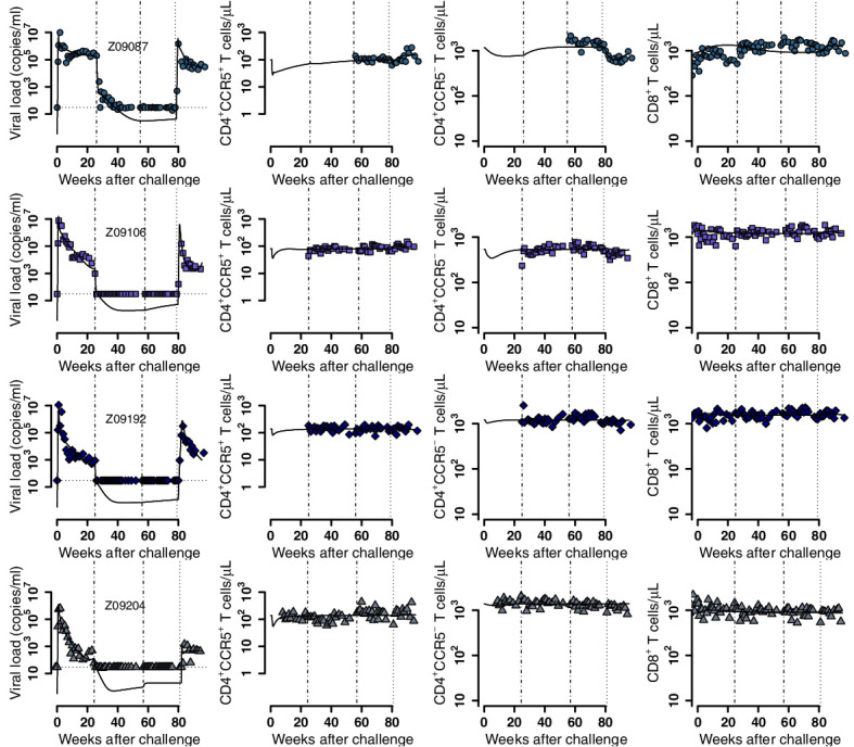
Figure 5—figure supplement 1.

Empirical data for peripheral T cell subset counts and plasma viral load (blue data points) and best fits of the model in Equations 2 and 3 to all blood T cell subsets before/after ATI for the control group. Dashed-dot lines: ART initiation and time relative to transplantation with respect to the other groups; dotted line: ATI. Each row is one animal (ID in the leftmost graph per row).
Figure 5—figure supplement 2. Individual fits of the best model to the blood T cell and viral load observations before/after ATI for the wild-type-transplant group.
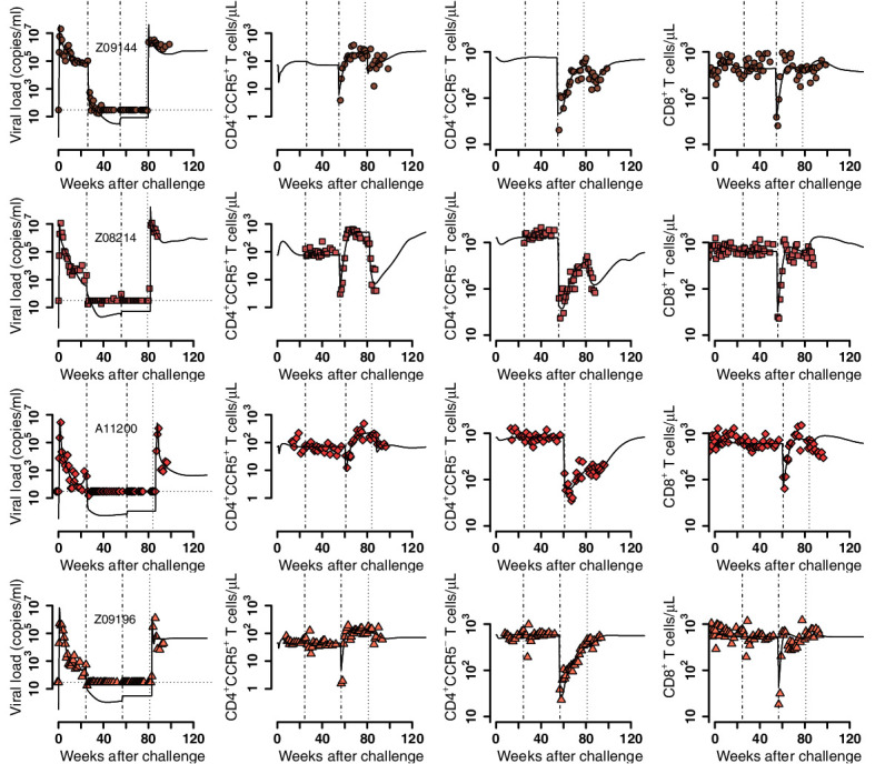
Figure 5—figure supplement 2.

Empirical data for peripheral T cell subset counts and plasma viral load (red data points) and best fits of the model in Equations 2 and 3 to all viral load observations and blood T cell subsets before/after ATI for the wild-type-transplant group (solid lines). Dashed-dot lines: ART initiation and transplantation; dotted line: ATI. Each row is one animal (ID in the leftmost graph per row).
Figure 5—figure supplement 3. Individual fits of the best model to the blood T cell and viral load observations before/after ATI for the ΔCCR5-transplant group.
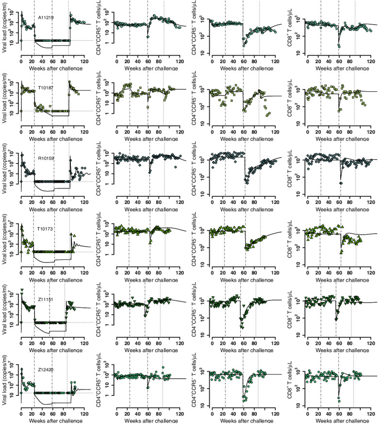
Figure 5—figure supplement 3.

Empirical data for peripheral T cell subset counts and plasma viral load (green data points) and best fits of the model in Equations 2 and 3 to all viral load observations and blood T cell subsets before/after ATI for the ΔCCR5-transplant group (solid lines). Dashed-dot lines: ART initiation and transplantation; dotted line: ATI. Each row is one animal (ID in the leftmost graph per row).