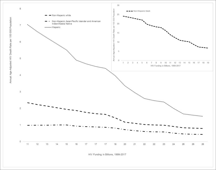
Figure 1.
Trends in annual age-adjusted HIV death rates per 100 000 population associated with annual domestic HIV funding in billion US dollars, United States, 1999-2017. The figure is a graph of annual US domestic HIV funding in current billion US dollars during 1999-2017 on the x-axis and annual average age-adjusted death rate (AADR) per 100 000 population for each of 4 racial/ethnic groups indicated in the figure legend. Because the AADRs for non-Hispanic black persons are orders of magnitude larger than the AADRs for the other racial/ethnic groups, that chart is inset.

