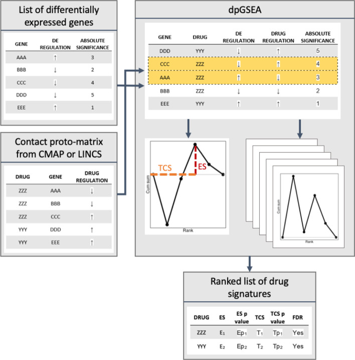
Fig. 2.
Overview of the dpGSEA pipeline and enrichment approach. Beginning from the left side of the diagram, the two primary inputs of dpGSEA are shown as tables. The top left table lists DEGs from, for example, a disease versus control study. The bottom left table contains the proto-matrix, which is analogous to MSigDB defined gene sets but contains a list of drug-gene actions rather than a gene set. dpGSEA merges the information in these tables by gene and ranks them by the absolute value of their significance. dpGSEA then estimates a running sum statistic based on drug-gene interaction and regulation. Highlighted in yellow are negatively correlated drug-gene interactions (opposing arrows). Enrichment distributions are formed [dotted red line, enrichment score (ES)] determining the maximum deviation of the running sum statistic plot, while the position of the maximum deviation (dotted orange line) represents the target compatibility score (TCS). dpGSEA then permutes the gene locations and generates new enrichment distributions along with null-enriched ES and TCS. The permutations are used to both normalize and generate statistical significance for each score. The output is a list of drugs ranked by their ES or TCS statistical significance (bottom center table). It should be noted that leading-edge genes are also included in the output (not shown)

