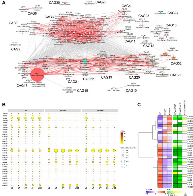
Fig. 4.
Alterations in the abundance of CAGs in response to both consumption of prebiotics and prebiotic feeding regime. (A) Microbial interaction network displays the interaction between different CAGs. Node size represents the mean abundance of ASV. The edges between the nodes indicate correlation (grey = negative, red = positive), with width of the edge corresponding to magnitude of the correlation. Correlations with absolute values less than 0.6 are not shown here. (B) Bubble plot shows the variation in the abundance of CAGs over time. The size and color of the circles represent mean relative abundance and coefficient of variance of each CAG respectively. (C) Heatmap for the mean relative abundance for each CAG for day 105, are expressed as Z scores along with FDR values for comparison between the groups using Mann-Whitney test followed by FDR correction using Benjamini and Hochberg procedure. CAGs were ordered by Spearman’s correlation analysis based on their relative abundance. (For interpretation of the references to color in this figure legend, the reader is referred to the web version of this article.)

