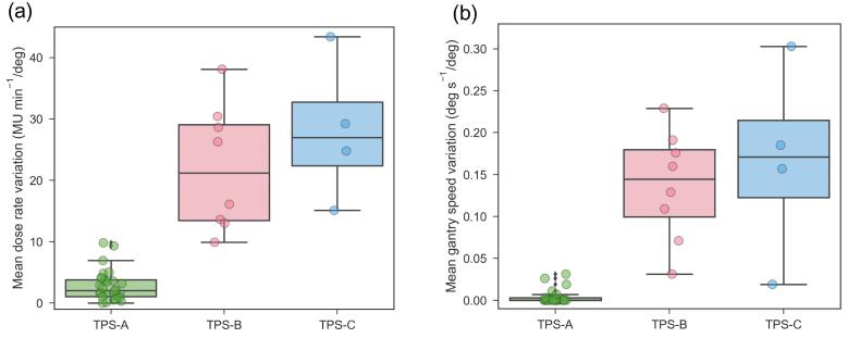
Fig. 3.
Box plots showing (a) the mean dose rate variations and (b) the mean gantry speed variations for the audit plans and the three treatment planning systems evaluated. The central line indicates the median value, the box limits represent the 1st and 3rd quartile and the whiskers indicate the minimum and maximum values.

