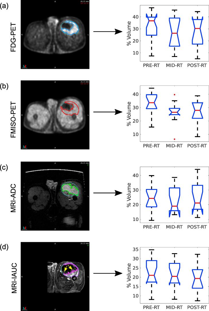
Fig. 3.
Analysis of high-intensity tumour sub-regions over time for: (a) FDG-PET scans; (b) FMISO-PET scans; (c) ADC maps; (d) IAUC maps from the injection to 60 s post-injection, with example low perfusion areas identified by yellow arrows. The left column shows example images and high-intensity tumour sub-region contours for the same slice of patient 15 (fibromyxoid sarcoma). The right column summarizes the distribution of volume percentages of high-intensity tumour sub-regions over all patients of the cohort, for the three radiotherapy (RT) treatment time points. Abbreviations are defined in Supplementary Table 1. (For interpretation of the references to colour in this figure legend, the reader is referred to the web version of this article.)

