
Figure 3.
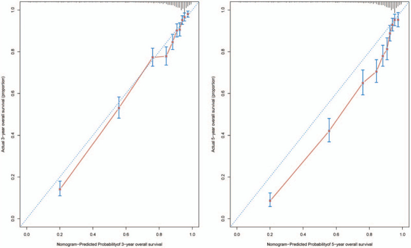
The calibration of the nomograms using the validation cohort set. The x axis represents the nomogram predicted survival rate, whereas the y axis represents the actual survival rate. (B = 1000).
Official websites use .gov
A
.gov website belongs to an official
government organization in the United States.
Secure .gov websites use HTTPS
A lock (
) or https:// means you've safely
connected to the .gov website. Share sensitive
information only on official, secure websites.
The calibration of the nomograms using the validation cohort set. The x axis represents the nomogram predicted survival rate, whereas the y axis represents the actual survival rate. (B = 1000).