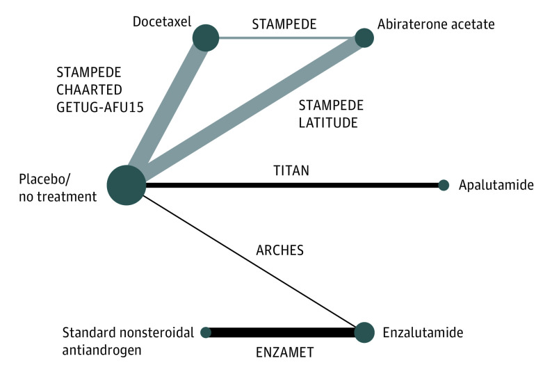
Figure 1. Network Graph of Treatment Comparison.
Graph depicts underlying evidence base of this study. Nodes (circles) represent competing treatments added to androgen-deprivation therapy and edges (lines) show which treatments have been compared. Node size proportional to the number of trials evaluating each treatment, edge thickness proportional to precision (the inverse of the variance of hazard ratios of overall survival) of each direct comparison. The labels on the edges are randomized clinical trials of pairs of treatments. Edges with gray color represent multiarm Systemic Therapy in Advancing or Metastatic Prostate Cancer: Evaluation of Drug Efficacy (STAMPEDE) trial. Study names are expanded in the footnotes to Table 1.

