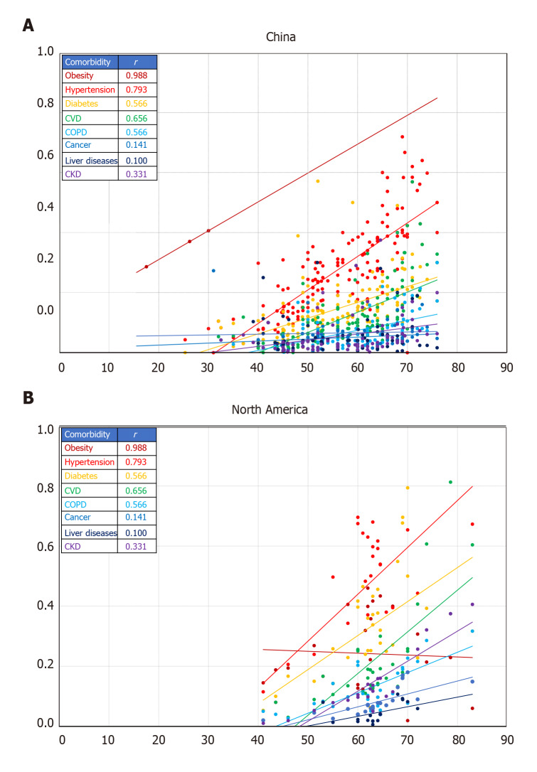
Figure 2.
Comparative profile for the correlation between comorbidities (proportion) and age (years) in coronavirus disease 2019 cases from China and North America. A: China; B: North America. Lines represent linear regression between the proportion of comorbidity and age. Colors correspond to the comorbidity in the insert table with the related Pearson correlation coefficient (r). Each data marker represents one entry. All r values are significant at P < 0.05 for the corresponding number of entries shown. Number of entries is per the source database[7].

