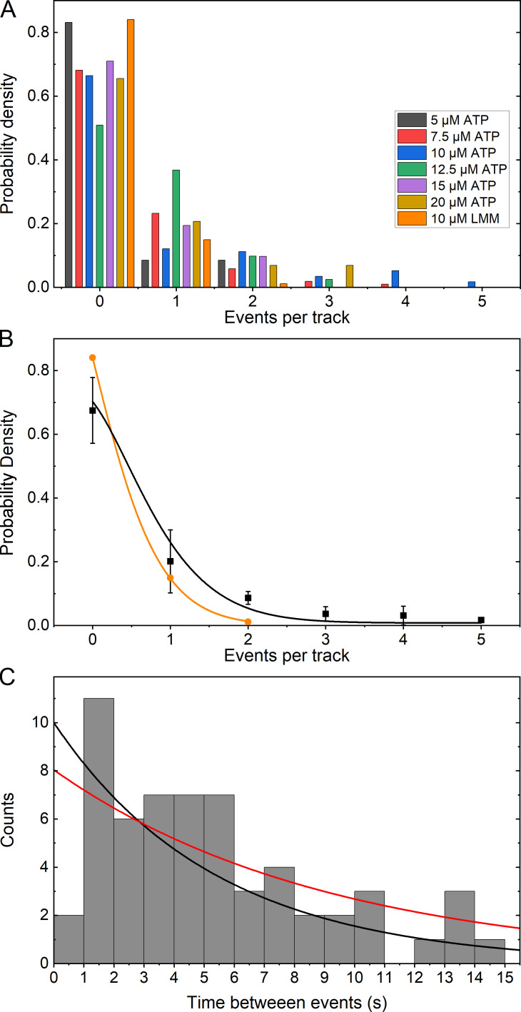
Figure 6.
Frequency of events per track and distribution of time between events. (A) Histogram of the frequency of detected events as a probability density given the total number of trajectories. All data refer to RLC-LMM except that indicated as LMM (orange) for the LMM-LMM data. Half of the tracks that contained zero events were removed from the probability calculation (see text). (B) Plot of the mean probability density (black squares) for each [ATP] from data shown in A, excluding the LMM-LMM data. The LMM-LMM data are shown in orange circles. The color-coded lines show a fit to Eq. 2. (C) Histogram showing the distribution of the time between events for all tracks that contained multiple events. The black line is an exponential distribution with the mean time between events equal to that of the data and the amplitude equal to the maximum of the data. The red line is a fit to Eq. 3.

