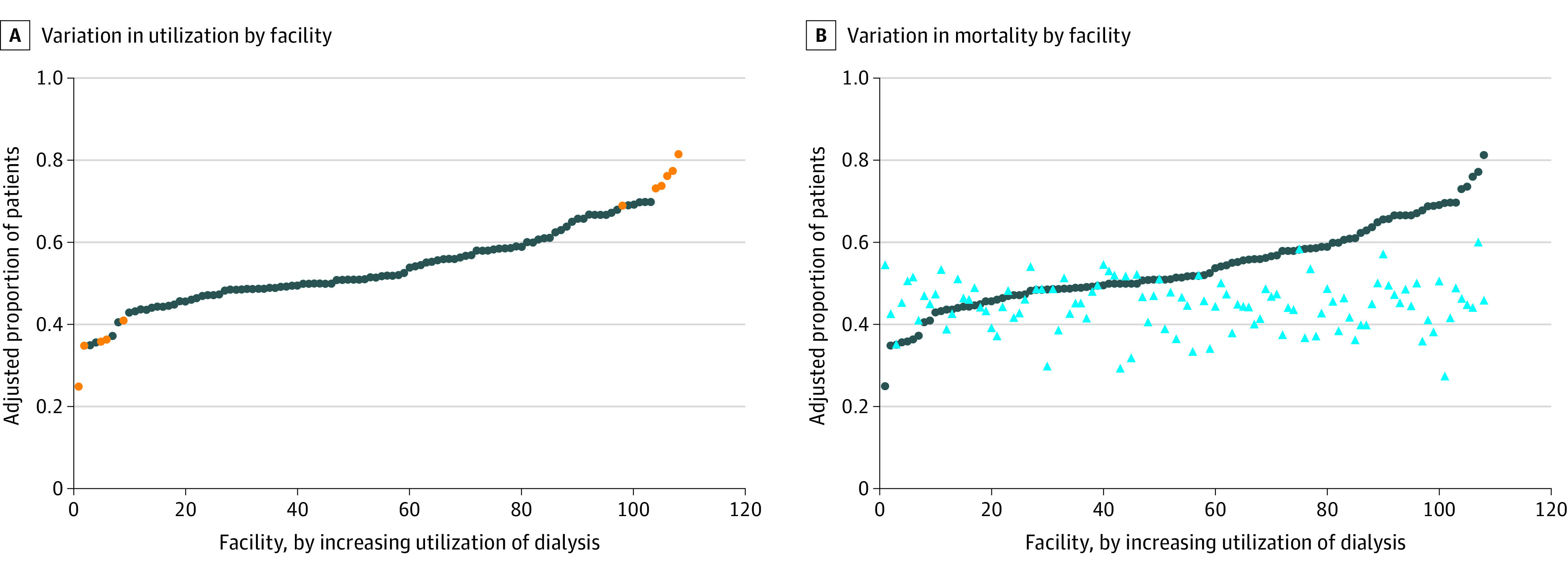
Figure. Variation in Dialysis Use and Mortality by Facility.

Blue circles in each panel represent the facility proportion of patients with kidney failure who received dialysis, adjusted for patient characteristics. A, Orange circles indicate that a facility’s dialysis use is statistically significantly different from the mean (0.54). B, Light blue triangles indicate the facility proportion of patients with kidney failure who died, adjusted for patient characteristics. The correlation coefficient between dialysis use and mortality was 0.03.
