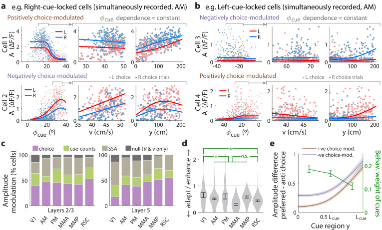
Figure 4. Cue-locked response amplitudes depend on view angle, speed, and cue frequency, but a large fraction exhibit choice-related modulations that increase during the course of the trial.
(a) Response amplitudes of two example right-cue-locked cells (one cell per row) vs. (columns) the visual angle at which the cue appeared (), running speed (), and location of the cue in the cue region. Points: amplitude data in blue (red) according to the upcoming right (left) choice. Lines: AICC-weighted model mean functions for right- vs. left-choice trials (lines); the model predicts the data to be random samples from a Gamma distribution with this behavior-dependent mean function. The data in the right two columns were restricted to a subset where angular receptive field effects are small, corresponding to the indicated area in the leftmost plots. (b) Same as (a) but for two (left-cue-locked) cells with broader angular receptive fields. (c) Percentages of cells that significantly favor various amplitude modulation models (likelihood ratio <0.05, defaulting to null model if none are significant), in the indicated cortical areas and layers. For layer 2/3 data, V1 has a significantly higher fraction of cells preferring the null model than other areas (p = 0.02, two-tailed Wilcoxon rank-sum test). For layer 5 data, V1 has a significantly lower choice-model preferring fraction than the other areas (p = 0.003). (d) Distribution (kernel density estimate) of adaptation/enhancement factors for cells that favor the SSA model. A factor of 1 corresponds to no adaptation, while for other values the subsequent response is scaled by this amount with exponential recovery toward 1. Error bars: S.E.M. Stars: significant differences in means (Wilcoxon rank-sum test). (e) Comparison of the behaviorally deduced weighting of cues (green, same as Figure 1e) to the neural choice modulation strength vs. location in the cue region (for contralateral-cue-locked cells only, but ipsilateral-cue-locked cells in Figure 4—figure supplement 2g have similar trends). The choice modulation strength is defined using the amplitude-modulation model predictions, and is the difference between predicted amplitudes on preferred-choice minus anti-preferred-choice trials, where preferred choice means that the neuron will have higher amplitudes on trials of that choice compared to trials of the opposite (anti-preferred) choice. For comparability across cells, the choice modulation strength is normalized to the average amplitude for each cell (Materials and methods). Lines: mean across cue-locked cells, computed separately for positively vs. negatively choice-modulated cells (data from all brain regions). Bands: S.E.M.


