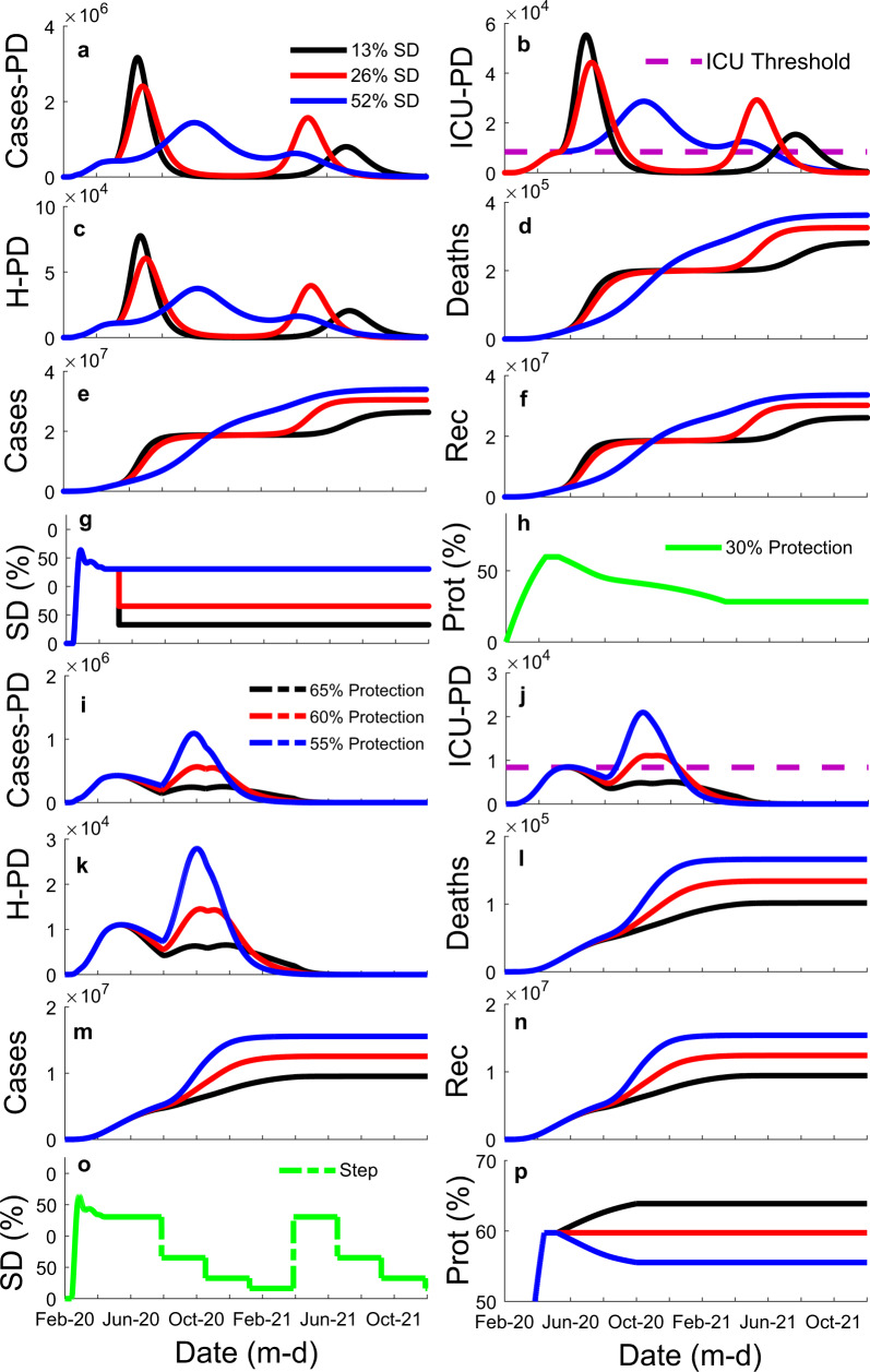
Fig. 5. Illustration of the influence of different mean social distance (SD) magnitude (13, 26, and 52%) and different percentage ratios of the unsusceptible or protected people over the whole population (protection—65, 60, and 55%) on the model results for the state of São Paulo.
It shows influence of SD (colored lines: black—13%; red—26%; blue—52%) through time, x-axis, on: a the number of cases per day (Cases-PD); b the number of estimated Intensive Care Unit patients per day (ICU-PD); c the number of estimated Hospitalized patients per day (H-PD)); d the number of estimated accumulated deaths; e the number of accumulated cases; and f the number of recuperated cases. g Constant strategy SD curves illustrating the three different magnitude tested. h The percentage ratio of the unsusceptible or protected people over the whole population (protection—Prot (%)) through time for graphs a–f. It also shows the influence of different protection levels (colored lines: black—65% endpoint; red—60% endpoint; blue—55% endpoint) through time, x-axis, on: i Cases-PD; j ICU-PD; k H-PD; l accumulated deaths; m accumulated cases; and n recuperated cases. o Manipulation of SD through time for graphs i–n, a stepping down strategy. p The three protection levels tested in graphs i–n.

