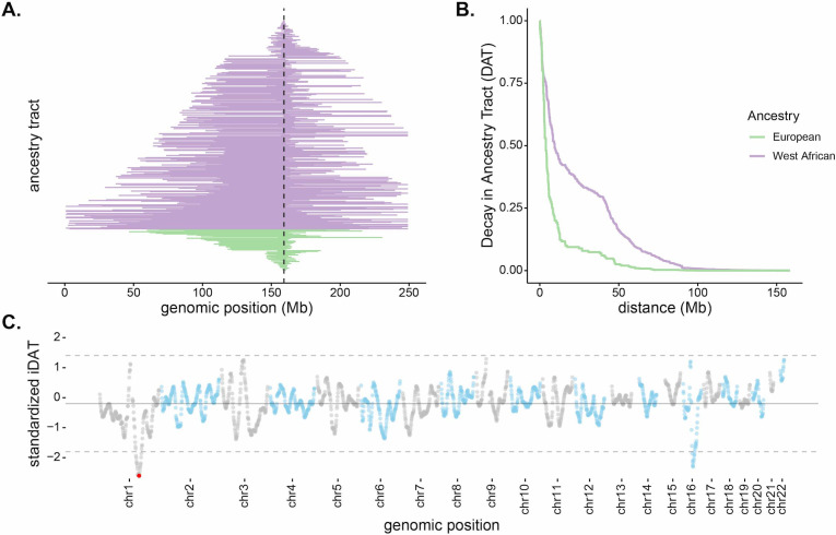
Figure 2. Long, high-frequency West African ancestry tracts span the DARC locus in Santiago.
(A) The distribution of West African (purple) and European (green) ancestry tract lengths spanning the DARC locus (dashed line). Each horizontal line represents a single chromosome in the population (n = 343, one chromosome was excluded due to having unknown ancestry at the DARC locus). (B) Decay in Ancestry Tract (DAT) as function of absolute distance from the Duffy-null allele for West African (purple) and European (green) ancestry tracts. (C) Mean standardized integrated DAT (iDAT) score for 20 Mb sliding windows (step size = 1 Mb), using standardized iDAT for 10,000 random positions across the genome. Horizontal solid gray line indicates mean windowed standardized iDAT score (−0.196), and horizontal dashed gray lines indicate three standard deviations from the mean windowed score. The red dot is the most extreme windowed standardized iDAT score (−2.602), indicative of a larger area under the curve for West African DAT compared to European DAT. This 20 Mb window contains the Duffy-null SNP.

