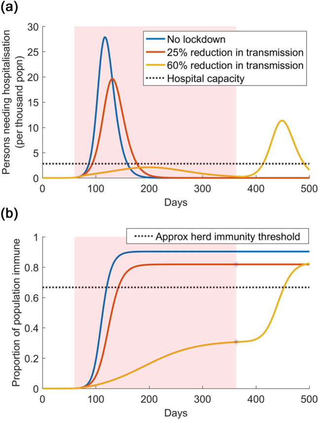
Figure 1.

Illustration of lockdown release, with no other interventions in effect. Shown are three scenarios: no lockdown (blue curve); an ineffective lockdown that reduces transmission by only 25% (red curve); and a more effective lockdown that reduces transmission by 60% (yellow) curve. The pink-shaded area denotes the duration of the lockdown: we assume that it is lifted when COVID-related hospitalisations decline to 10% of capacity. (a) Upper panel: numbers of individuals needing hospitalisation over time. (b) Lower panel: the accumulation of population immunity over time, for the scenarios simulated in the upper panel. Stars on the red and yellow curves indicate the level of population immunity that would be estimated by sero-surveillance, at the time of lifting the lockdown. The dashed line indicates the approximate level of herd immunity (approximate because it is calculated as , a formula for homogenous populations): a population having a higher level of immunity would effectively be protected from a resurgent epidemic, without need for further interventions or lockdown.
