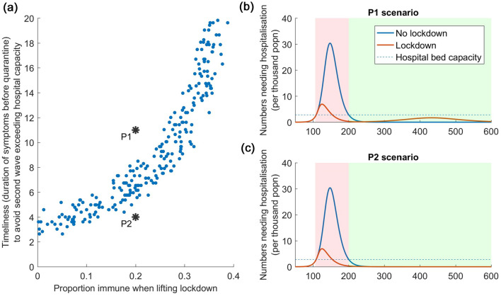
Figure 3.
How sero-surveillance can guide post-lockdown strategy, with R0 = 2.5. (a) Left hand panel shows how sero-surveillance (x-axis) can guide decisions about the required intensity of post-lockdown PCR testing in the community (y-axis). The figure is divided into two zones, by the ‘band’ of points. In the lower zone, population immunity is high enough, and the PCR testing strategy is intense enough, to prevent a resurgent epidemic from overwhelming the health system, and conversely in the upper zone. Points P1 and P2 show examples in both zones, their dynamics illustrated in the right-hand (b,c). As in Fig. 2, pink-shaded areas denote the duration of the lockdown, while the green shaded area denotes the period when the test-and-isolate strategy is implemented. In the left-hand panel, each point represents a scenario drawn from the range of parameter values listed in Table 1; the spread of these points therefore captures the uncertainty in these different parameters.

