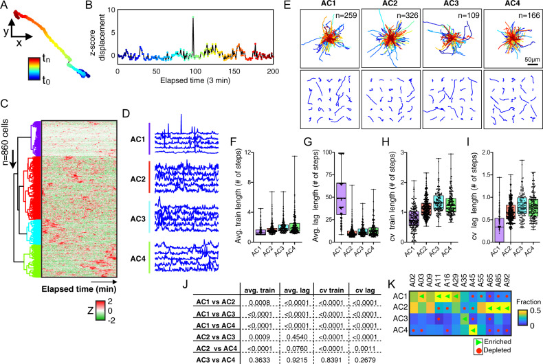
Fig. 3. Cellular activity describes age-associated motility patterns and heterogeneity.
A Color-coded trajectory of a representative cell as a function of elapsed time (navy blue-to-maroon). B Plot showing the corresponding one-dimensional displacement for the same individual cell, here after referred as the activity profile. C Heatmap showing the cellular activity profiles for all cells, across all ages (n = 860 cells). Each row represents a single cell and each column from left to right represents elapsed time. Five colored dendrogram branches represent hierarchical clustering using the city block distances with ward linkages along the axes of maximum variation. D Line plots showing five representative cellular activity profiles for single cells within each activity cluster. E Trajectories of cells within each activity cluster; top panel shows a grid of 25 randomly selected cell trajectories per cluster; bottom panel shows the origin-centered trajectories for all cells per cluster, with the number of cells within each cluster indicated in the upper left corner. F–I Box plots showing the extent of bursty dynamics per activity clusters; average train lengths (F), average lag lengths (G), CV of train lengths (H), CV of lag lengths (I). Error bars denote the maximum and minimum, with individual data points shown as black dots. J Table of p-values showing comparisons among the four activity clusters for average train length, average lag length, cv train length, and cv lag length. K Heatmap showing the abundance of cells within each activity cluster per age, green triangles denote significantly enriched and red circles denote significantly depleted (p-value < 0.05).

