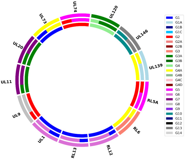
Figure 1.

Doughnut plot reporting the results of a genotyping analysis. Each dataset is depicted as an annulus divided into sections representing the 13 hypervariable genes analysed. The size of the coloured bars within each section indicate the proportion of the genotypes detected, according to the key on the right. The analyses of three datasets are plotted concentrically to facilitate comparison.
