Figure 3.
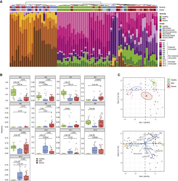
Patient stratification based on myeloid signature
(A) Stacked histogram of the PhenoGraph monocyte clusters per patient (n = 75 individuals), ordered by cluster composition similarities. Disease severity and grade for each patient are shown on top of the stacked histogram.
(B) Boxplots of frequencies of the indicated monocyte clusters in the different disease severities. Statistical analyses were performed with a Mann-Whitney-Wilcoxon test corrected for multiple testing based on the Holm method, and p values are shown if the results were significant (p < 0.05).
(C) Top: principal-component analysis (PCA) of monocyte and neutrophil cluster frequencies and myeloid immune cell subset frequencies across the cohort. The PCA plot (top) shows the first 2 principal components separating the samples. The percentage of explained variance for each component is shown in brackets. Each dot represents a patient, colored by disease status. A concentration ellipse and the mean point are shown for each group. Bottom: biplot displaying simultaneously the observations (patients) as gray dots and the variables (cell subsets) as vectors.36 Vectors indicate the direction and strength of each cell component to the overall distribution. Variables grouping together are positively correlated.

