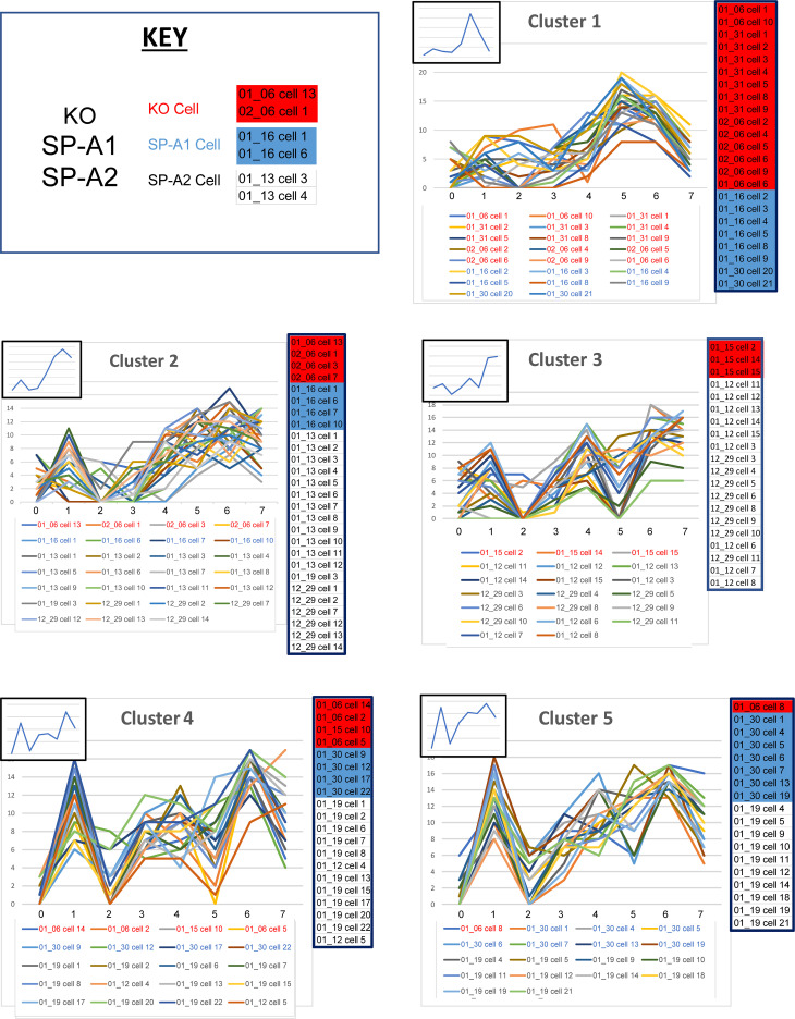
Figure 8. Profiles of clusters 1–5 (out of 10).
For this analysis the full data set (all groups — KO, SP-A1, SP-A2) is used, and a cluster analysis is shown (Supplemental Figure 3). For clusters 1–5 defined by the dendrogram, the line graphs (signatures) for included cells are shown, along with insets showing the graph generated by the mean biomarker percentages (Table 7). Clusters 6–10 are in Figure 9. The IDs of cells in each cluster are below the graphs (red, KO; blue, SP-A1; black, SP-A2), and a color-coded list (red, KO; blue, SP-A1; white, SP-A2) of the included cells is presented on the right side of each graph to facilitate comparison.

