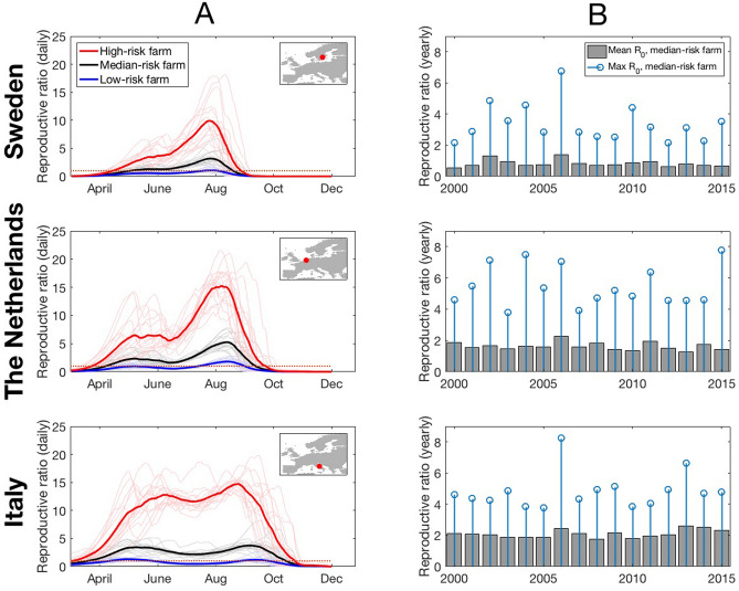
Figure 4.
Predicted daily dynamics for farms in the area of the trap sites in each country (shown in insets). Left column (A): on each day of year (March-November) for P = 5% (blue curve), median P = 50% (black curve) and P = 95% farms (red curve) averaged over each year’s prediction for that day. Individual years (2000–2015) are shown as fainter curves of same colour. Right column (B): The mean over all days March-November for each year 2000–2015 (grey bars) with the maximum value, over all days March-November for each year 2000–2015 (blue circles).

