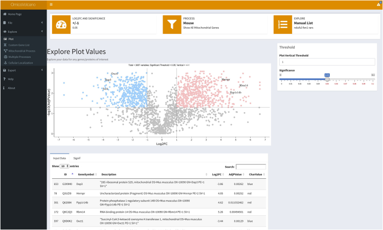
Figure 3.
A volcano plot example with specific interactively selected gene labels
Transcriptomic data are visualized where significantly increased transcripts are shown in light red and significantly decreased transcripts in light blue. Non-significant transcripts are shown in gray. Three increased and three decreased transcripts are indicated in the plot as examples, showing the software’s capability to label individual transcripts of interest.

