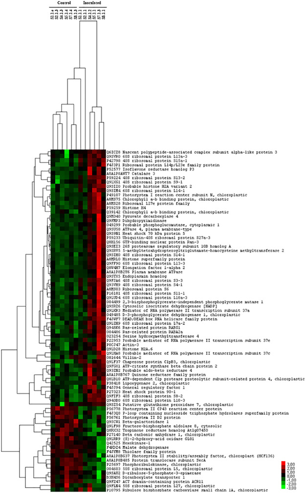
Fig 2. Hierarchical clustering of differentially produced cork oak proteins.
The heat map clusters the expression patterns of the 80 proteins with altered abundances between inoculated and control plants. Each column represents one cork oak plant; the control (C) plants are the first 6 columns on the left, and the 6 columns on the right are the inoculated (I) plants. The first 60 lines starting from the top of the heat map are proteins with an increased level in the inoculated samples (red color code) and the 20 lines towards the bottom, are proteins with a decreased level in the inoculated samples (green color code). The color scale of the heat map ranges from -3 to 3 (from light green to red).

