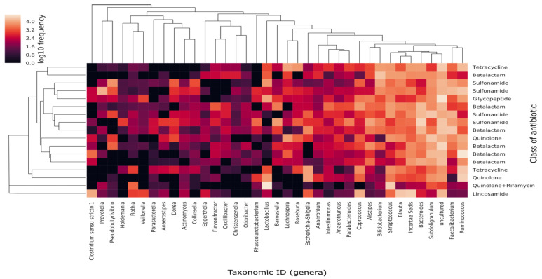
Figure 6.
Heat map of the relative abundance and distribution of the 50 most abundant genera among samples. Each dot represents the overall bacterial community in each sample Y axis shows individual samples, tagged according to class of antibiotic and displayed following a dendrogram (left side of the graph) constructed by clustering analysis of Bray-Curtis distances among samples. X axis represents the 50 most abundant genera in terms of median of relative frequencies. Genera dendogram was constructed following Unweighted Pair Group Method using Arithmetic averages (UPGMA) clustering analysis, which groups genera according to their co-occurrence among samples.

