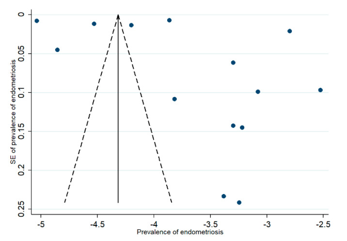
Figure A1.
Funnel plot for prevalence data. Note: blue dots represent individual studies; the outer dotted line indicates the triangular region within which 95% of studies are expected to lie in the absence of both biases and heterogeneity; the solid vertical line represents the line of no effect, derived using fixed-effect meta-analysis.

