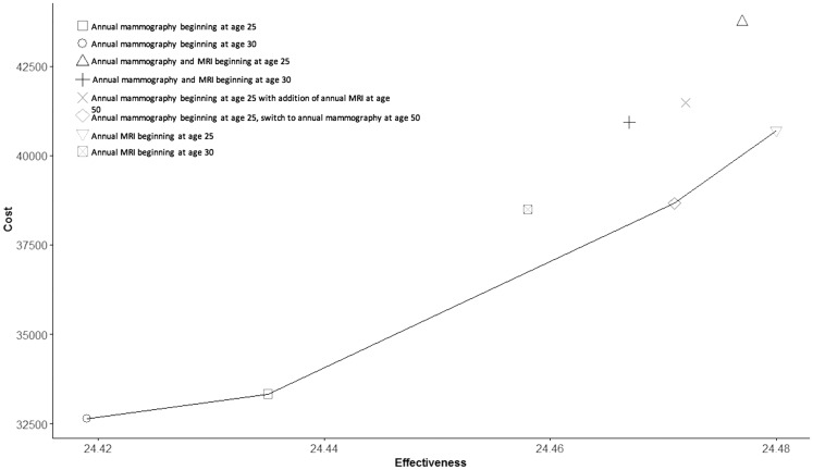
Figure 4.
Cost-effectiveness frontier. Costs by effectiveness (ie, quality-adjusted life-years) are plotted for each surveillance strategy. Each point on the graph corresponds to the incremental cost-utility ratio for each respective surveillance strategy. Strategies that lie to the left of the frontier are dominated by those that form the frontier, either directly or via extended dominance. MRI = magnetic resonance imaging.

