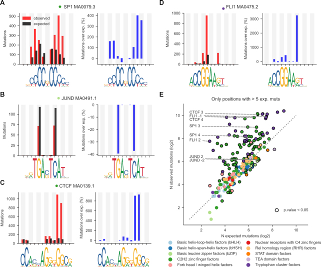
Figure 2.
Mutation rate at specific positions within the TF binding motif. (A–D) The left graph in each panel presents the observed (red bar) and expected (black bar) number of mutations at each mutated dipyrimidine position of the four binding motifs shown in Figures 1A–D. To compute the expected mutations at each dipyrimidine position the tetramer containing the dipyrimidine was sampled from the flanks of the same 2001-nucleotides sequence, and their observed number of mutations averaged. The right graph presents the corresponding percentage of increase of the rate of mutations over that expected (blue bar) at each mutated dipyrimidine position. Positive values thus correspond to increased mutation rate, while negative values occur at positions with decreased mutation rate. (E) Scatterplot representing the relationship between the number of observed and expected mutations (in log2 scale) at all dipyrimidine positions within all binding motifs included in the study. Each dot, hence corresponds to an individual dipyrimidine position in a binding motif colored following the family of the corresponding TF, according to the legend below the panel. Dipyrimidine positions with significant increased or decreased number of mutations with respect to the expectation (G-test P-value < 0.05) are encircled in black.

