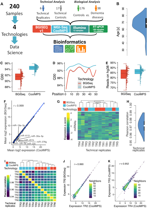
Figure 1.
Study setup and quality control. (A) In the study we measured 240 individual blood samples using two fundamentally different sequencing approaches and compare the data by bioinformatics approaches before we compute the concordance to RT-qPCR profiles. The 240 samples include one part that has been used only for assessment of technical properties (6 and 17 samples in blue and gray) as well as a second part to evaluate performance related to biomarker discovery (176 controls in green and 38 dementia cases in orange). (B) Distribution of the age of the individuals included in the study, shown as violin plot. The black box spans the first to the third quartile and the white dot shows the median. (C) Distribution of the average Q30 value per sample for the two technologies, shown as boxplot (left) and dotplot (right). Each sample is shown as one dot. The boxes span the first to the third quartile with the horizontal line inside the box representing the median value. The whiskers show the minimum and maximum values or values up to 1.5 times the interquartile range below or above the first or third quartile if outliers are present. (D) Q30 value over all samples per technology as function of the position in the read. The smoothed curve is fitted by a generalized additive model using a cubic regression spline. The gray area represents the confidence interval of the fit. (E) Distribution of the percentage of reads mapping to the human reference genome hg38 without mismatch per technology, shown as boxplot (left) and dotplot (right). Each sample is shown as one dot. The boxes span the first to the third quartile with the horizontal line inside the box representing the median value. The whiskers show the minimum and maximum values or values up to 1.5 times the interquartile range below or above the first or third quartile if outliers are present. (F) Scatter plot of the average expression of all miRNAs in all samples for the two technologies. The blue line is the regression line. The Pearson correlation is shown in the upper left part of the plot. MiRNAs with a fold change larger than two between both technologies are highlighted. (G) Heat map of the clustered expression z-scores of miRNAs (rows) and technical replicates (columns). The color code for the columns represents the technology. The dendrogram shows the hierarchical clustering of the samples with Euclidean distance and complete linkage. (H) Distribution of all 12*11/2 = 66 pairwise Pearson correlation coefficients, shown as violin plot. The black box spans the first to the third quartile and the white dot shows the median. (I) Correlation matrix of the expression values of all miRNAs for all technical replicates. The dendrogram shows the hierarchical clustering of the samples with Euclidean distance and complete linkage. (J) Scatter plot of miRNAs for the best correlation between two technical replicates. The dotted line represents the angle bisector. The Pearson correlation is shown in the upper left part of the plot. The points are colored according to the point density in their neighborhood. (K) Scatter plot of miRNAs for the worst correlation between two technical replicates. The dotted line represents the angle bisector. The Pearson correlation is shown in the upper left part of the plot. The points are colored according to the point density in their neighborhood.

