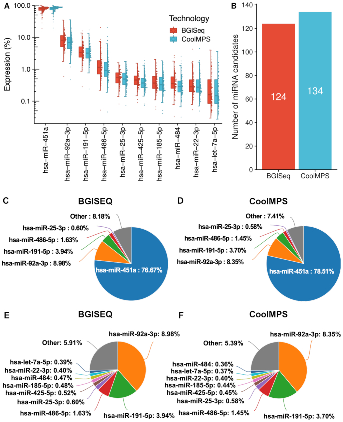
Figure 3.
Distribution to microRNAs. (A) Distribution of the read percentage of the 10 most abundant miRNAs in the CoolMPS and BGISEQ data, shown as boxplot (left) and dotplot (right). Each sample is shown as one dot. The boxes span the first to the third quartile with the horizontal line inside the box representing the median value. The whiskers show the minimum and maximum values or values up to 1.5 times the interquartile range below or above the first or third quartile if outliers are present. (B) Number of novel microRNA candidates for both technologies. (C) Pie chart for the top five miRNAs on the BGISEQ. (D) Pie chart for the top five miRNAs on the CoolMPS. (E) Pie chart for the top ten miRNAs on the BGISEQ after exclusion of the most abundant miR-451a. (F) Pie chart for the top ten miRNAs using CoolMPS after exclusion of the most abundant miR-451a.

