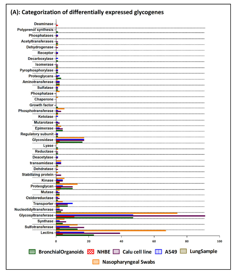
Figure 1.
(A) Bar chart representing the categorization of the differentially expressed glycogenes identified from the 6 SARS-CoV-2 transcriptomic datapoints. The graph is generated using the GraphPad Prism 5 software. (B) Clustered heatmap generated using the Heatmap w ggplot (Galaxy version 2.2.1). Using a blue-white-red coloring scheme, clustering is performed using the default maximum similarity measure and the complete hierarchical clustering measure. The row labels represent the significantly differentially expressed glycogenes (with ≥1.5-fold change) form 6 datapoints identified from the SARS-CoV-2 infected human cell lines, organoids, ex vivo lung and nasopharyngeal samples.


