Figure 2.
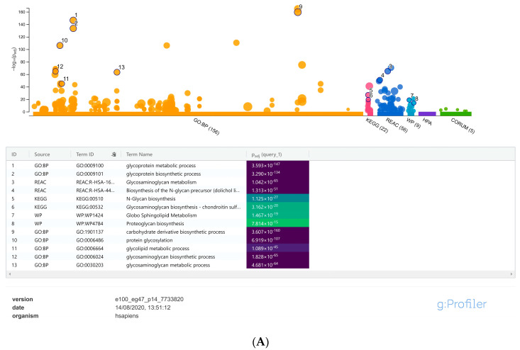
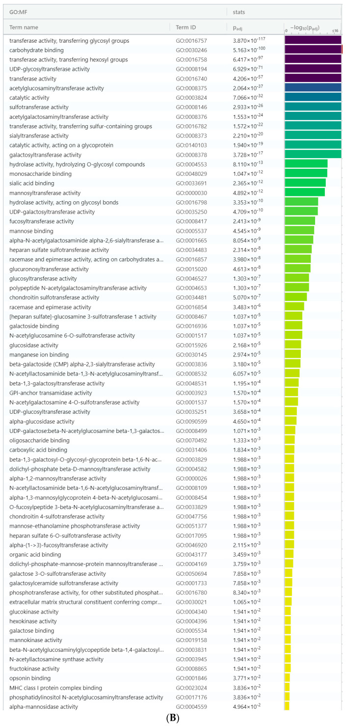
(A) Manhattan plot generated from the g:profiler toolset for the functional enrichment analysis using the default significant threshold measures. The x-axis shows the functional terms grouped and color-coded by the respective data sources and the corresponding enrichment p-values in negative log10 scale are illustrated on the y-axis. A more detailed result table below the image, highlights the manually selected top ranking 10 functional enriched terms and corresponding p-values. (B) More detailed result of the GO molecular function output generated from the g:Profiler tool highlighting the maximum represented categories among the input list of differentially expressed glycogenes with their corresponding enrichment p-values in negative log10 scale.


