FIGURE 3.

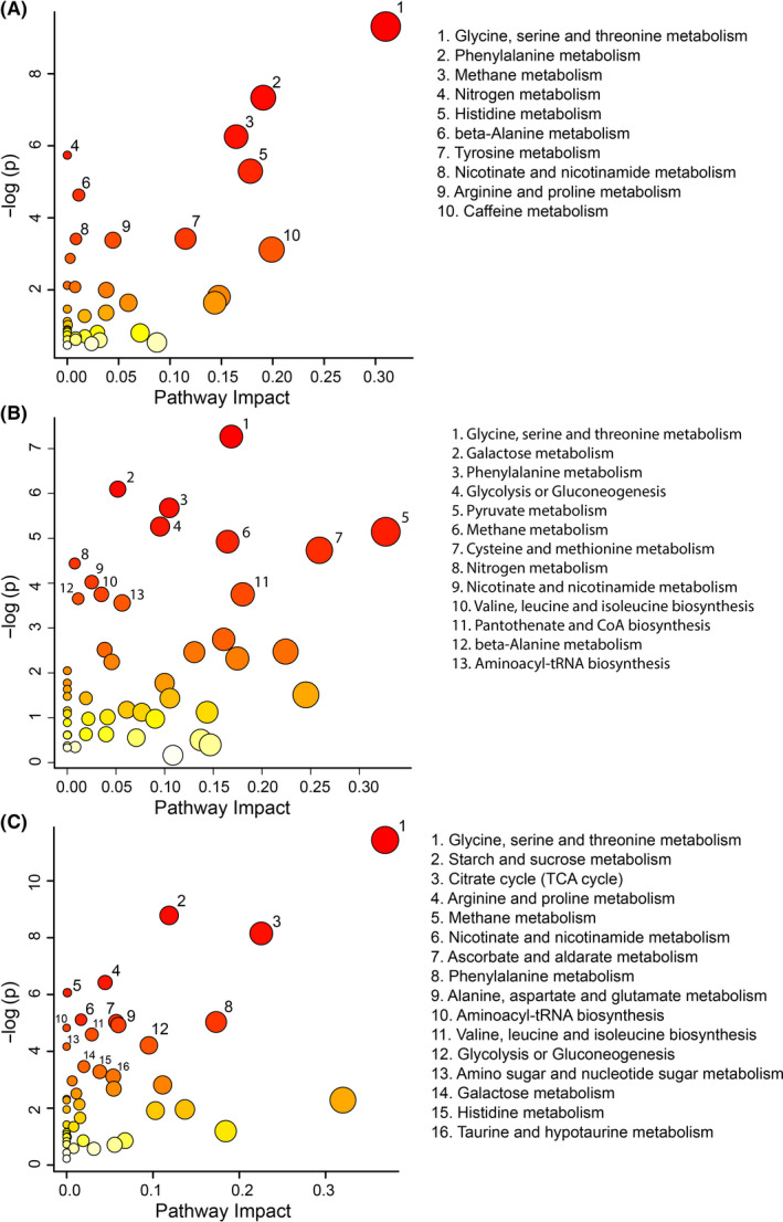
Metabolomic pathway analysis for the comparison of the obesity vs control groups (A), GDM vs control groups (B), and obesity vs GDM groups (C). A higher value on the y‐axis indicates a lower P‐value for the pathway. The x‐axis gives the pathway impact, which indicates how affected the pathway is by the metabolites identified as significantly altered. Only metabolic pathways with P < .05 are labelled. This figure was created using the lists of metabolites identified as significantly altered between the obese and control groups by either MW or VIAVC testing
