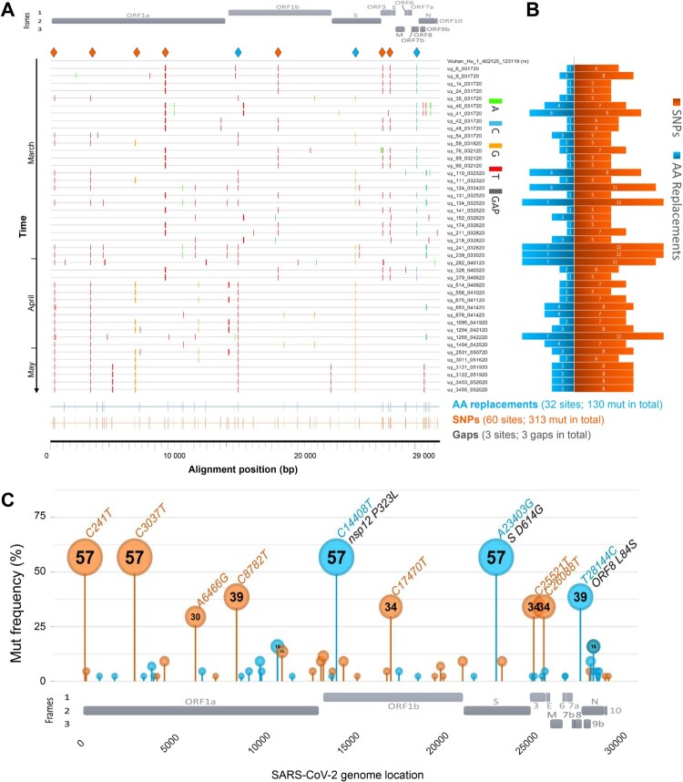
Figure 2.
SARS-CoV-2 mutation patterns over time and mutation hotspots along the genome. (A) Highlighter plot showing mutations (mut) of Uruguayan study sequences compared to the reference Wuhan-Hu-1 sequence as master (on top). Mutations are shown as ticks, colour-coded according to the legend to the right. Study sequences are sorted along the y-axis according to sampling time, with the earliest sequences on top and most recent sequences at the bottom. A SARS-CoV-2 genome map with the three reading frames’ coding genes is shown for orientation on top. All single-nucleotide polymorphisms (SNPs) are summarized in orange, and all SNPs resulting in amino acid (AA) replacements are summarized in blue at the bottom of the plot at the respective alignment positions. SNPs that are prevalent in >30% of study sequences are highlighted by orange or blue (if AA replacement) diamonds on top of the plot. (B) Mirror bar chart summarizing the number of SNPs (orange) and AA replacements (blue) per study sample, aligned with the study sample IDs in A. (C) Lollipop plot summarizing the frequency of SARS-CoV-2 mutations in the Uruguayan study cohort (n = 44), using the same colour code as in B. A SARS-CoV-2 genome map with base-pair positions is shown at the bottom. The bubbles’ y-coordinates indicate mutation frequencies, which are also shown inside the bubbles for mutations with >10% prevalence. Mutation details are shown in orange (SNPs, bp mutation) or blue and black (AA replacements, bp mutation and aa mutation/affected protein region) for mutations >30% prevalence.

