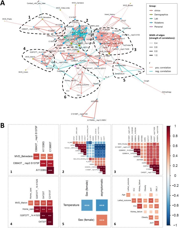
Figure 5.
Correlation network analysis of virologic, demographic, and clinical parameters among Uruguayan study samples/participants. (A) In the correlation network plot, nodes represent clinical, demographic, laboratory, mutational, and personal parameters, and red and blue edges represent positive and negative correlations between connected parameters, respectively. Only significant correlations (P < 0.05) are displayed between parameters with at least two positive events. Edge width corresponds to the strength of the correlation. Nodes are colour-coded based on the grouping in clinical, demographic, laboratory, mutation, or personal parameters according to the legend to the upper right, and node size corresponds to the degree of relatedness of correlations. The six most prominent mixed correlation clusters are encircled with dashed lines and shown in greater detail as correlograms in the dashed boxes with matching numbers (1–6). (B) In the correlograms, squares are sized and colour-coded according to the magnitude of the correlation coefficient (r). The colour code of r values is shown to the right (red colours represent positive, blue colours negative correlations between two parameters). Asterisks indicate statistically significant correlations (*P < 0.05, **P < 0.01, ***P < 0.005). Correlation analysis was done using nonparametric Spearman rank tests. MVD: Montevideo, HI: healthcare institution, ICU: intensive care unit, AHT: arterial hypertension, DM II: diabetes mellitus type II, COPD: chronic obstructive pulmonary disease.

