FIGURE 4.

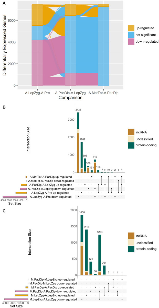
Comparisons of differential gene expression. (A) Alluvial plot showing up- or down-regulation of genes significantly differentially expressed in all anther (A) meiotic stage comparisons. The comparisons are: A.LepZyg-A.Pre, leptotene–zygotene versus pre-meiosis; A.PacDip-A.LepZyg, pachytene–diplotene versus leptotene–zygotene; and A.MetTet-A.PacDip, metaphase I–tetrad versus pachytene–diplotene. The bar at each stage represents the total complement of genes which are differentially expressed in any anther comparison, the bar is colored by the proportion of genes in each successive meiotic stage comparison on the x axis which is up-regulated (yellow), down-regulated (pink), or not significant (blue). The lines connecting the bars between x axis comparisons represent movement of genes from one expression category to another between successive meiotic stage comparisons. The vast majority of all DEGs (pink and yellow) at any stage are present in the comparison of leptotene–zygotene anthers to pre-meiotic anthers. A large proportion of DEGs in the first comparison do not show a significant change in expression between pachytene–diplotene and leptotene–zygotene, as represented by the pink and yellow lines connecting to the blue shaded area in the second x-axis comparison. (B) UpSet plot of the same anther meiotic stage comparisons and (C) UpSet plot of meiocyte (M) stage and meiocyte-anther tissue comparisons. UpSet plots are similar in principal to the more commonly used Venn and Euler diagrams in that they represent the intersection of distinct groups (sets) but are better at representing large numbers of groups (Lex et al., 2014). The total number of genes in each group (the set size) is represented by a histogram on the left-hand side of the x-axis. The black dots underneath the x-axis indicate which groups are represented in the histogram above showing the number of genes represented by this group. Where only one dot is present the histogram above represents the number of genes unique to this group. Where two or more dots are connected by a line the histogram above represents the number of genes which occur in the connected groups. The comparisons are: M.PacDip-M.LepZyg, meiocytes at pachytene–diplotene versus meiocytes at leptotene–zygotene; M.LepZyg-A.LepZyg, meiocytes at leptotene–zygotene versus anthers at the same stage; M.PacDip-A.PacDip, meiocytes at pachytene–diplotene versus anthers at the same stage. The prefixes A. and M. in the sample names depict anther and meiocyte samples, respectively.
