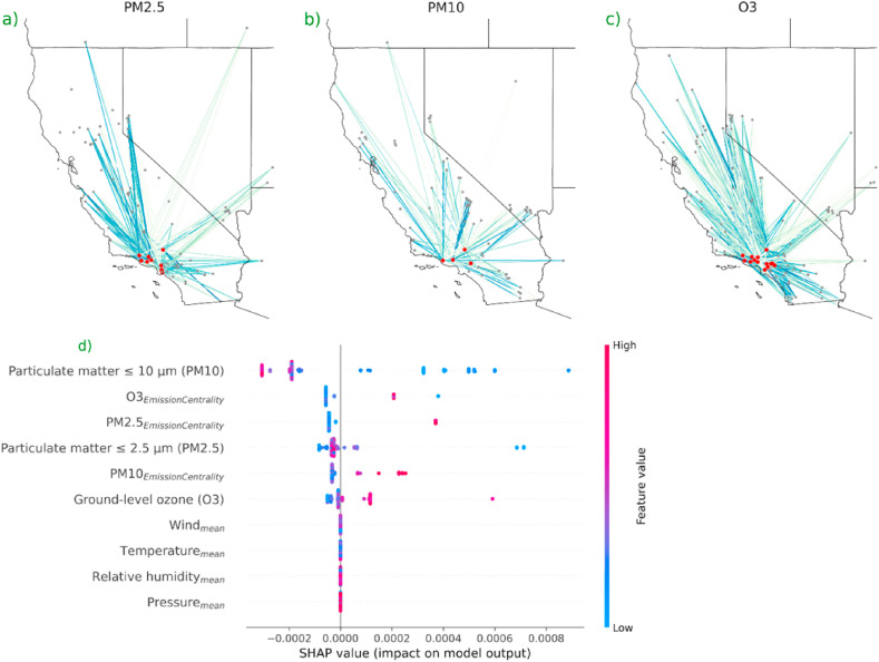
Fig. 2.
The results obtained from EDEM. (a) Represents an emission network of PM 2.5 for an arbitrary day. The nodes (in red) represents the monitoring stations in counties of Los Angeles and Ventura. The influence of the emissions of adjoining counties, grey nodes, are represented by the edge. A stronger edge represents a higher influence. (b) Represents the emission network of PM 10 for an arbitrary day. (c) Represents the emission network of O3 for an arbitrary day. (d) Depicts the impact, direction, and relative importance of the association between exposure to pollutants for a short period of time and COVID-19 cases (also refer to Fig. A.4). Emission centrality reflects the county-level effects obtained from Equation (8) through the current flow betweenness centrality measure. (For interpretation of the references to colour in this figure legend, the reader is referred to the Web version of this article.)

