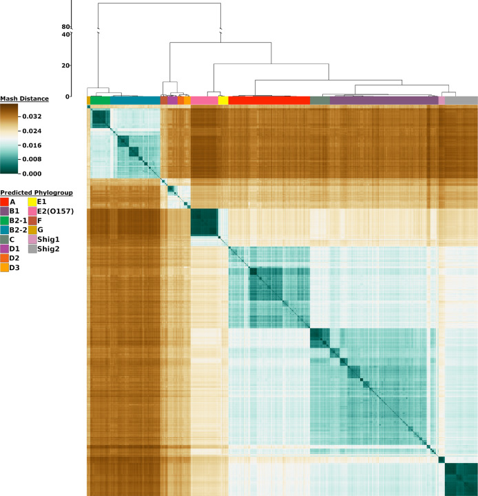
Fig. 1. Heatmap representation of 10,667 genomes using Mash distances.
The color bars at the top of the heatmap identify the phylogroups as predicted from the analysis. The scale to the left of the dendrogram corresponds to the resultant cluster height of the entire dataset obtained from hclust function in R. The colors in the heatmap are based on the pairwise Mash distances. Shades of teal represent similarity between genomes, with the darkest teal corresponding to identical genomes reporting a Mash distance of 0. Shades of brown represent low genetic similarity per Mash distance, with the darkest brown indicating a maximum distance of ~0.039. Genomes of relative median genetic similarity have the lightest color.

